print('Hello World')Hello WorldPython has an extremely rich and healthy ecosystem of data science tools. Unfortunately, to outsiders this ecosystem can look like a jungle (cue snake joke). In this blog post I will provide a step-by-step guide to venturing into this PyData jungle.
What’s wrong with the many lists of PyData packages out there already you might ask? I think that providing too many options can easily overwhelm someone who is just getting started. So instead, I will keep a very narrow scope and focus on the 10% of tools that allow you to do 90% of the work. After you mastered these essentials you can browse the long lists of PyData packages to decide which to try next.
The upside is that the few tools I will introduce already allow you to do most things a data scientist does in his day-to-day (i.e. data i/o, data munging, and data analysis).
It has happened quite a few times that people came up to me and said “I heard Python is amazing for data science so I wanted to start learning it but spent two days installing Python and all the other modules!”. It’s quite reasonable to think that you have to install Python if you want to use it but indeed, installing the full PyData stack manually when you don’t know which tools you actually need is quite an undertaking. So I strongly recommend against doing that.
Fortunately for you, the fine folks at Continuum have created the Anaconda Python distribution that installs most of the PyData stack for you, and the modules it doesn’t provide out of the box can easily be installed via a GUI. The distribution is also available for all major platforms so save yourself the two days and just use that!
After Python is installed, most people start by launching it. Again, very reasonable but unfortunately dead wrong. I don’t know a single SciPythonista that uses the Python command shell directly (YMMV). Instead, IPython, and specifically the IPython Notebook are incredibly powerful Python shells that are used ubiquitously in PyData. I strongly recommend you directly start using the IPython Notebook (IPyNB) and don’t bother with anything else, you won’t regret it. In brief, the IPyNB is a Python shell that you access via your web browser. It allows you to mix code, text, and graphics (even interactive ones). This blog post was written in an IPyNB and it’s rare to go find a talk at a Python conference that does not use the IPython Notebook. It comes preinstalled by Anaconda so you can just start using it. Here’s an example of what it looks like:
print('Hello World')Hello WorldThis thing is a rocket – every time I hear one of the core devs talk at a conference I am flabbergasted by all the new things they cooked up. To get an idea for some of the advanced capabilities, check out this short tutorial on IPython widgets. These allow you to attach sliders to control a plot interactively:
from IPython.display import YouTubeVideo
YouTubeVideo('wxVx54ax47s') # Yes, it can also embed youtube videos.Normally, people recommend you start by learning NumPy (pronounced num-pie, not num-pee!) which is the library that provides multi-dimensional arrays. Certainly this was the way to go a few years ago but I hardly use NumPy at all today. The reason is that NumPy became more of a core library that’s used by other libraries which provide a much nicer interface. Thus, the main library to use for working with data is Pandas. It can input and output data from all kinds of formats (including databases), do joins and other SQL-like functions for shaping the data, handle missing values with ease, support time series, has basic plotting capabilities and basic statistical functionality and much more. There is certainly a learning curve to all its features but I strongly suggest you go through most of the documentation as a first step. Trust me, the time you invest will be set off a thousand fold by being more efficient in your data munging. Here are a few quick tricks to whet your appetite:
import pandas as pd

df = pd.DataFrame({ 'A' : 1.,
                    'B' : pd.Timestamp('20130102'),
                    'C' : pd.Series(1, index=list(range(4)), dtype='float32'),
                    'D' : pd.Series([1, 2, 1, 2], dtype='int32'),
                    'E' : pd.Categorical(["test", "train", "test", "train"]),
'F' : 'foo' })df| A | B | C | D | E | F | |
|---|---|---|---|---|---|---|
| 0 | 1 | 2013-01-02 | 1 | 1 | test | foo |
| 1 | 1 | 2013-01-02 | 1 | 2 | train | foo |
| 2 | 1 | 2013-01-02 | 1 | 1 | test | foo |
| 3 | 1 | 2013-01-02 | 1 | 2 | train | foo |
Columns can be accessed by name:
df.B0 2013-01-02
1 2013-01-02
2 2013-01-02
3 2013-01-02
Name: B, dtype: datetime64[ns]Compute the sum of D for each category in E:
df.groupby('E').sum().DE
test 2
train 4
Name: D, dtype: int32Doing this is in NumPy (or *gasp* Matlab!) would be much more clunky.
There’s a ton more. If you’re not convinced, check out 10 minutes to pandas where I borrowed this from.
The main plotting library of Python is Matplotlib. However, I don’t recommend using it directly for the same reason I don’t recommend spending time learning NumPy initially. While Matplotlib is very powerful, it is its own jungle and requires lots of tweaking to make your plots look shiny. So instead, I recommend to start using Seaborn. Seaborn essentially treats Matplotlib as a core library (just like Pandas does with NumPy). I will briefly illustrate the main benefits of seaborn. Specifically, it:
pandas DataFrame so the two work well together.While pandas comes prepackaged with anaconda, seaborn is not directly included but can easily be installed with conda install seaborn.
%matplotlib inline # IPython magic to create plots within cellsimport seaborn as sns
# Load one of the data sets that come with seaborn
tips = sns.load_dataset("tips")
sns.jointplot("total_bill", "tip", tips, kind='reg');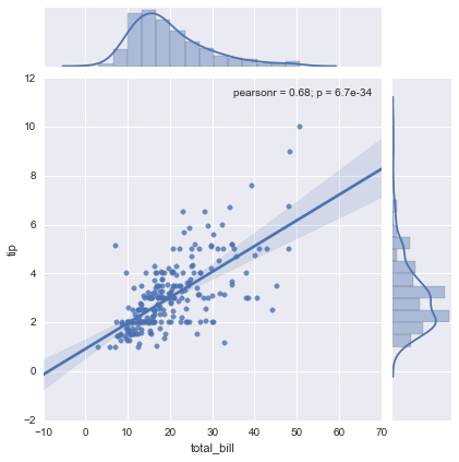
As you can see, with just one line we create a pretty complex statistical plot including the best fitting linear regression line along with confidence intervals, marginals and the correlation coefficients. Recreating this plot in matplotlib would take quite a bit of (ugly) code, including calls to scipy to run the linear regression and manually applying the linear regression formula to draw the line (and I don’t even know how to do the marginal plots and confidence intervals from the top of my head). This and the next example are taken from the tutorial on quantitative linear models.
DataFrameData has structure. Often, there are different groups or categories we are interested in (pandas’ groupby functionality is amazing in this case). For example, the tips data set looks like this:
tips.head()| total_bill | tip | sex | smoker | day | time | size | |
|---|---|---|---|---|---|---|---|
| 0 | 16.99 | 1.01 | Female | No | Sun | Dinner | 2 |
| 1 | 10.34 | 1.66 | Male | No | Sun | Dinner | 3 |
| 2 | 21.01 | 3.50 | Male | No | Sun | Dinner | 3 |
| 3 | 23.68 | 3.31 | Male | No | Sun | Dinner | 2 |
| 4 | 24.59 | 3.61 | Female | No | Sun | Dinner | 4 |
We might ask if smokers tip differently than non-smokers. Without seaborn, this would require a pandas groupby together with the complex code for plotting a linear regression. With seaborn, we can provide the column name we wish to split by as a keyword argument to col:
sns.lmplot("total_bill", "tip", tips, col="smoker");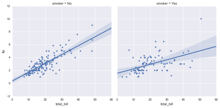
Pretty neat, eh?
As you dive deeper you might want to control certain details of these plots at a more fine grained level. Because seaborn is just calling into matplotlib you probably will want to start learning this library at that point. For most things I’m pretty happy with what seaborn provides, however.
The idea of this blog post was to provide a very select number of packages which maximize your efficiency when starting with data science in Python.
Thanks to Katie Green and Andreas Dietzel for helpful feedback on an earlier draft.